Selecting the right shutter colors can transform a home’s curb appeal and interior style. But one wrong choice can throw off the entire design, making shutters stand out for the wrong reasons. Many homeowners underestimate the impact of color on architectural harmony, lighting, and resale value.
This guide explores the most common pitfalls people face when choosing shutters, from mismatched tones to ignoring undertones. You’ll also learn how to work with your home’s existing color palette, avoid design mistakes, and make confident, informed choices that last for years. Whether you’re considering bold colors or sticking with neutrals, these tips will help you avoid costly missteps and create a cohesive look you’ll love.
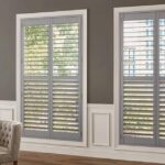
5 Common Mistakes When Selecting Shutter Colors
1. Ignoring Your Home’s Architectural Style
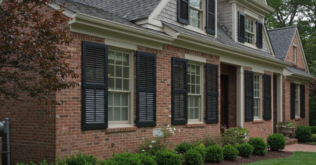
Your home’s architectural style should guide your choice of shutter color. Colonial homes often pair best with classic black, deep green, or white shutters, while Mediterranean styles tend to favor earthy tones. Choosing a color that conflicts with the architectural theme can make shutters look out of place, disrupting the home’s visual flow. Always consider historical and stylistic cues before finalizing paint colors.
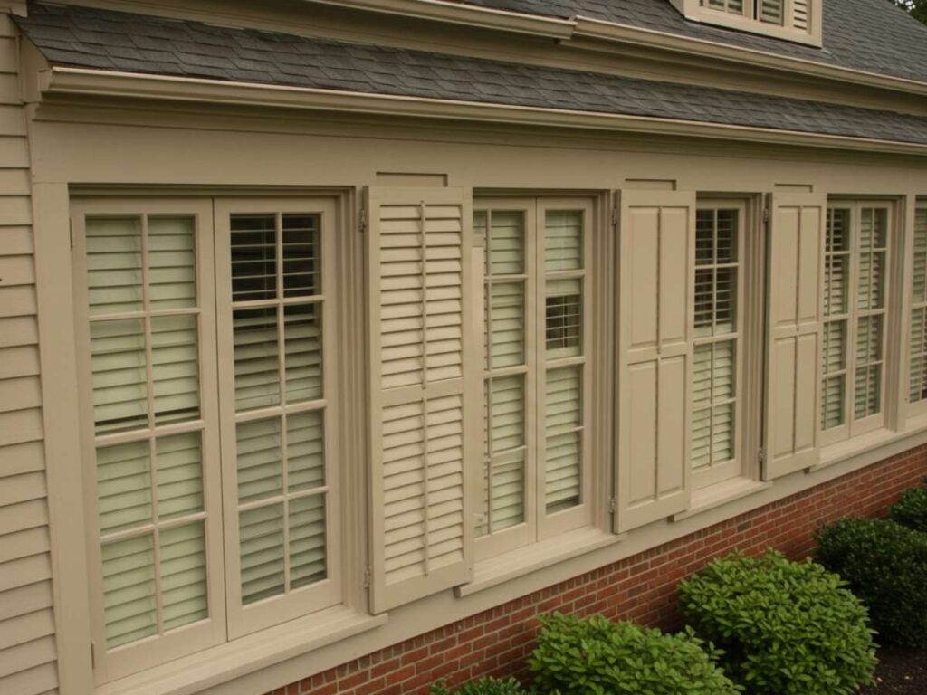
2. Overlooking Undertones in House Colors
Even subtle undertones can make or break your design. A warm beige siding with cool gray shutters can create a mismatched look. Understanding whether your house colors have warm, cool, or neutral undertones ensures your shutters complement rather than clash. Using color swatches or paint samples next to your home’s exterior is the best way to identify undertone conflicts before making a commitment.
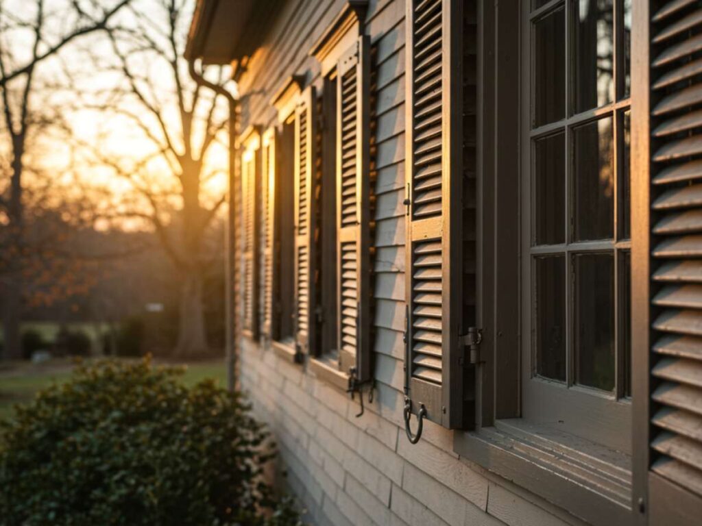
3. Choosing Colors Based on Store Lighting
Paint chips or shutter samples can look dramatically different under store lighting compared to natural daylight. What appears as a perfect navy indoors might look almost black outside. Test sample colors against your home’s exterior at different times of the day—morning, midday, and evening—to see how natural and artificial lighting changes the perception.
4. Ignoring Resale Value with Bold Colors
Bright red or vivid blue shutters can look striking, but may limit your home’s appeal to future buyers. While bold colors can make a personal statement, they often date more quickly than neutral colors like white, black, or gray. If you plan to sell within a few years, choose a timeless shade that complements a wide range of color schemes.
5. Skipping Professional Guidance
A color consultant or window treatment specialist can help you navigate tricky decisions. They can use virtual tools to preview how shutters will look in your chosen shade, ensuring your selection aligns with the cohesive design of your home. Skipping this step can lead to costly repainting or replacement if the results don’t match your expectations.
Do’s and Don’ts When Choosing Shutter Colors
Do's
- Consider your home’s architectural style before selecting a shade.
- Match the undertones of your siding and trim for a cohesive design.
- View paint samples in different lighting conditions.
- Consider the resale value if you plan to move in the future.
Dont's
- Don’t rely solely on in-store lighting when picking colors.
- Don’t choose a color without comparing it to existing house colors.
- Don’t ignore how shutters interact with nearby design elements, such as doors or roofing.
- Don’t choose bold colors without considering long-term maintenance and appeal.
FAQs About Shutter Colors
1. How do I choose the right shutter color for my home?
Start by evaluating your home’s architectural style, existing house colors, and undertones. Test color swatches against your siding in different lighting conditions. Consulting a professional can help you narrow down choices that enhance curb appeal and fit your design goals.
2. Should my shutters match my front door?
Not always. Matching can create a unified look, but complementary colors can add depth and interest. The key is to ensure your color palette feels intentional, whether you opt for matching or contrasting shades.
3. Are bold shutter colors a bad idea?
Not necessarily. Bold colors can add personality, but they may reduce resale appeal and require more frequent upkeep. If you choose a vivid shade, ensure it works with your overall color scheme and architectural style.
Make The Right Choice of Shutter Colors
Choosing the right shutter colors is about more than picking a shade you like—it’s about creating harmony with your home’s architectural style, lighting, and overall color scheme. By avoiding the most common mistakes, you can enjoy a design that enhances both curb appeal and long-term value.
Book an appointment with MITS Rockville today to explore color options with a specialist who understands how to balance style, function, and lasting beauty.